Firefighter Identity Through an Urban Lens
Cuartel 29 redefines firefighter identity through a vibrant fusion of urban aesthetics and lived experience
In many parts of the world, firefighter culture is defined by tradition, camaraderie, and the long histories of individual fire companies. In Chile, that same spirit has found a new form of expression through design and urban aesthetics. From this perspective emerges Cuartel 29, a brand created by firefighters that reinterprets firefighter identity through bold graphics, contemporary illustration, and a visual language deeply connected to the reality of those who respond to emergencies every day.
Cuartel 29 was born from a clear idea: the need to create an identity that truly represents the modern volunteer firefighter. One that reflects the essence, character, and everyday reality of the men and women who respond to alarms and emergencies in Chile’s volunteer-based fire service. For decades, the public image of firefighters has often been associated with institutional formality and protocol. Yet behind that structure exists a vibrant culture shaped by experience, resilience, humor, and brotherhood.
The project emerged as a response to that cultural gap. Instead of following the traditional aesthetic usually associated with firefighting institutions, Cuartel 29 embraced a more urban, rebellious, and expressive visual identity inspired by the daily life of volunteers. The brand seeks to portray the firefighter not only as a symbol of service, but also as part of a living culture that evolves with each generation.
Where Tradition Meets Urban Expression
From its early stages, the public response was overwhelmingly positive. Firefighters and supporters quickly recognized in the brand’s designs a visual identity that resonated with their own experiences and sense of belonging. This reception allowed Cuartel 29 to expand its presence across different regions of Chile, participating in fairs, exhibitions, and events connected to the firefighting community.
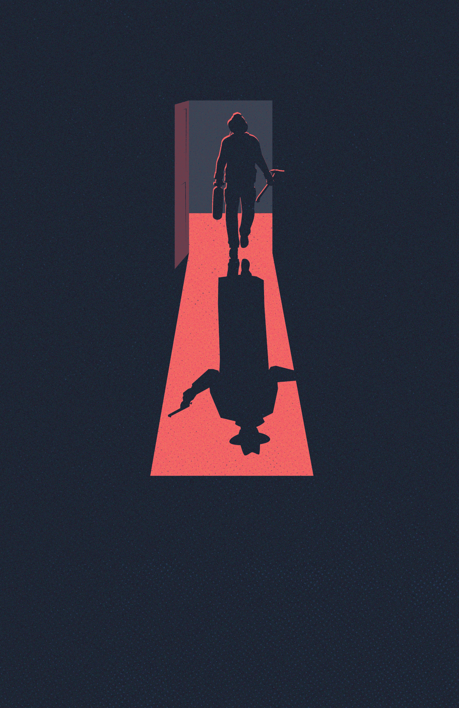
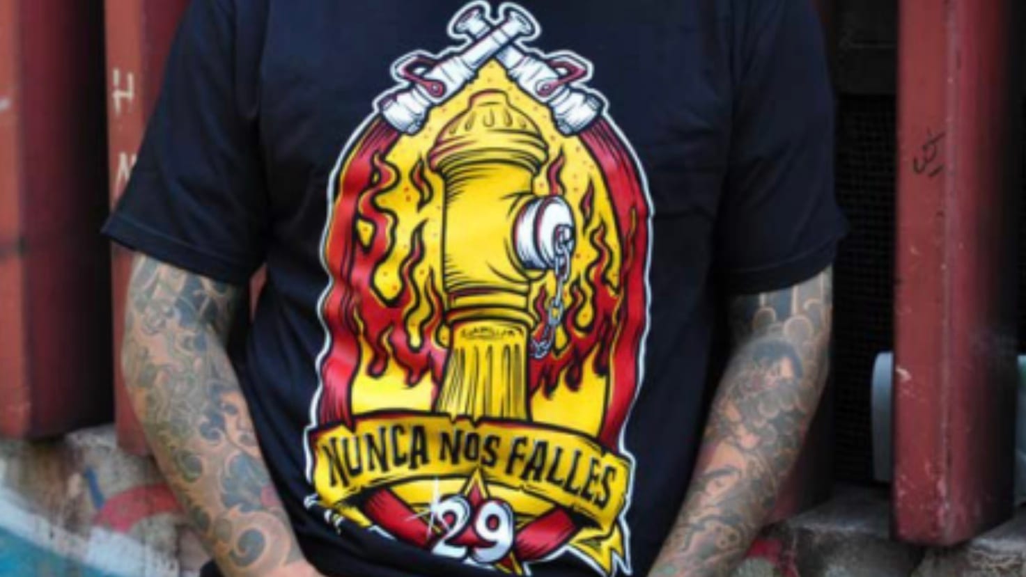
One of the defining elements of the brand is its distinctive visual style. Cuartel 29 combines strong illustration, bold typography, and vibrant colors to create striking compositions that celebrate the intensity of firefighting life. Its graphics often reinterpret scenes from the world of emergency response through characters, symbolic imagery, and dynamic narratives.
Rather than idealizing the profession, the brand focuses on portraying its most human aspects: camaraderie, sacrifice, humor, and the pride of belonging to a community that steps forward when others need help. The designs reflect the raw energy of the profession, capturing moments of action, risk, and identity.
Design as a Reflection of Lived Experience
This visual approach results in an aesthetic that is innovative, colorful, and unapologetically bold. It opens new ways of representing the experiences and exploits of firefighters, emphasizing a life lived without filters and driven by purpose. In many ways, the imagery reflects the intensity of those who live close to the flames and accept the risks that come with the role.
Beyond its graphic language, Cuartel 29 has developed a diverse catalog that allows this identity to exist in many different forms. The brand’s designs appear on a wide range of products including T-shirts, sweatshirts, socks, sunglasses, lighters, notebooks, and stickers. Each item becomes a canvas where the brand’s visual narrative can be expressed.
This expansion reflects a central philosophy behind the project: firefighter culture extends far beyond the walls of the fire station. For many volunteers, being a firefighter is not simply a duty or activity, but a defining part of their identity. Cuartel 29 seeks to capture that cultural dimension, allowing firefighters to express their identity in everyday life through design and style.
A Cultural Platform Built From Within
At the same time, the brand places strong emphasis on quality and craftsmanship. The goal is not only to create visually impactful pieces, but also to offer products that firefighters and supporters can wear and use with pride.
Another key component of the project is its custom design service. Through this initiative, Cuartel 29 collaborates with fire companies, institutions, and events to develop exclusive designs that reflect the identity of each organization. These collaborations transform local traditions, symbols, and stories into unique graphic pieces that are later produced as apparel or commemorative merchandise.
In doing so, the brand contributes to strengthening the visual identity of firefighter communities while preserving their individual histories and traditions.
Honoring Service Through Contemporary Creativity
Today, Cuartel 29 stands as a creative platform that blends design, culture, and identity. Its work demonstrates that the firefighting world can also be expressed through art, illustration, and contemporary visual language, while still honoring the values of service, volunteerism, and community that define the profession.
More than a brand, Cuartel 29 represents a cultural expression created from within the firefighter community itself.
An identity built by those who understand exactly what it means to hear the alarm sound and answer the call.